How to Write Product Comparison Posts: Complete Guide for Devices, Apps, and Tools
Product comparison posts consistently rank among the highest-converting content types, with conversion rates 3-5x higher than standard blog posts. Why? Because readers searching for comparisons are deep in the buying journey—they’re evaluating specific options and ready to make decisions.
Whether you’re comparing smartphones, project management apps, or marketing automation tools, this comprehensive guide will show you how to create comparison content that ranks in search engines, builds trust with readers, and drives conversions.
Marketing and SEO research consistently shows that comparison-style content performs well because it targets users with strong purchase intent who are already evaluating options and seeking decision-making information. HubSpot insights on SEO and conversion-focused content
Table of Contents
Why Product Comparison Content Works
Understanding the psychology behind comparison searches helps you create more effective content.
Search Intent Behind Comparison Queries
Users searching for product comparisons exhibit specific behavioral patterns:
- Late-stage buyers (80-90% of searchers): Already narrowed choices to 2-3 options
- High commercial intent: Ready to purchase within days or weeks
- Information-hungry: Want detailed, specific data before committing
- Skeptical: Looking for unbiased validation from third parties
When someone searches “iPhone 15 vs Samsung S24,” they’re not casually browsing—they’re comparing features to justify a $1,000+ purchase decision.
Conversion Rates of Comparison Content
Industry benchmarks show comparison content significantly outperforms other formats:
- Standard blog posts: 1-2% conversion rate
- Product comparison posts: 5-8% conversion rate
- “Best [category]” roundups: 6-10% conversion rate
- Alternatives posts: 7-12% conversion rate (highest intent)
Why such high conversion? Comparison readers have already identified their problem and potential solutions. Your job is helping them choose confidently.
Types of Comparison Content
Three main formats dominate search results:
- Head-to-Head (X vs. Y): Direct comparison of two products
- Example: “Notion vs. Asana: Which Project Tool Is Better?”
- Best for: Established competitor pairs
- Multi-Product Roundups (Best [Category]): 5-10 products compared
- Example: “7 Best Video Editing Apps for Mac in 2026”
- Best for: Category education and broader awareness
- Alternatives Lists: Competitors to a dominant player
- Example: “10 Slack Alternatives for Team Communication”
- Best for: Capturing searches for specific brand alternatives
3 Types of Product Comparison Posts
Understanding these distinctions helps you choose the right format.
Head-to-Head (X vs. Y)
Structure: Two products compared in-depth across 8-12 criteria.
Ideal for:
- Clear competitor pairs (iPhone vs. Samsung, Zoom vs. Teams)
- Similar price points and features
- Products solving the same core problem
Advantages:
- Highly focused and detailed
- Easier to maintain (only 2 products)
- Ranks for specific “X vs Y” queries
Word count: 1,500-2,500 words
Multi-Product Roundups (Best [Category])
Structure: 5-10 products compared with summary tables and individual sections.
Ideal for:
- Category education
- Broader keyword targeting
- Capturing multiple buyer personas
Advantages:
- Ranks for “[best + category]” keywords
- Positions you as category authority
- One piece addresses multiple comparison queries
Word count: 2,500-4,000 words
Alternatives Lists (Alternatives to X)
Structure: Competitors to a dominant market leader.
Ideal for:
- Challenging market leaders
- Targeting dissatisfied users of established products
- High-intent traffic
Advantages:
- Captures searches from users actively seeking alternatives
- Highest conversion rates (8-12%)
- Less competition than “best [category]” posts
Word count: 2,000-3,500 words
Pre-Writing: Research and Preparation
Solid research differentiates amateur comparison content from authoritative guides.
Defining Your Target Audience
Don’t write for “everyone.” Narrow your focus:
Bad: “Best smartphones for everyone”
Good: “Best smartphones for photographers under $800”
Effective comparison content is typically built through hands-on testing, user feedback analysis, and cross-referencing multiple sources to ensure accuracy and credibility in evaluations. Example methodology used in SaaS comparison research
Audience definition questions:
- What’s their skill level? (Beginner, intermediate, expert)
- What’s their budget range?
- What’s their primary use case?
- What technical knowledge can I assume?
Example segmentation:
- “Best laptops for video editors” (professionals, high budget)
- “Best laptops for college students” (budget-conscious, basic needs)
- “Best business laptops for remote workers” (durability, battery, enterprise features)
Each segment requires different comparison criteria and product selections.
Choosing Products to Compare
Selection criteria:
Same category and price tier (don’t compare 2,000 headphones)
Similar target audience (consumer vs. enterprise)
Genuine alternatives readers are actually considering
Available for purchase (not discontinued or regional-only)
Sufficient differentiation (comparing near-identical products wastes time)
How many to compare:
- X vs. Y posts: 2 products only
- Best [category] roundups: 5-7 products (10 maximum)
- Alternatives lists: 7-10 alternatives
More than 10 becomes overwhelming and reduces conversion.
Establishing Comparison Criteria
Transparent criteria are the foundation of credible comparisons.
Devices (smartphones, laptops, cameras):
- Performance specs (processor, RAM, storage)
- Build quality and design
- Display quality
- Battery life
- Camera quality (for phones)
- Price and value
- Warranty and support
Apps and software:
- Core features and capabilities
- User interface and experience
- Integration options
- Pricing and plans
- Customer support quality
- Learning curve
- Mobile app availability
SaaS tools:
- Feature depth and breadth
- Scalability and limits
- Pricing transparency
- Implementation complexity
- Customer success support
- API and integrations
- Uptime and reliability
Pro tip: State your criteria explicitly in the introduction so readers understand your evaluation framework.
Sourcing Accurate Data
Primary sources (most reliable):
- Manufacturer websites and spec sheets
- Hands-on testing (if possible)
- Official pricing pages
- Direct customer support inquiries
Secondary sources (verify carefully):
- Review aggregators (G2, Capterra, TrustPilot, Amazon reviews)
- Tech review sites (The Verge, TechCrunch, PCMag)
- Reddit discussions (authentic user experiences)
- YouTube reviews (visual demonstrations)
Verification checklist:
- Cross-reference data across 2-3 sources
- Check publish/update dates (is this current?)
- Verify pricing on official site directly
- Test features yourself when possible
- Note when data was last verified
The 8-Step Framework for Writing Comparison Posts
Follow this proven structure for consistently effective comparison content.
1: Write a Clear, SEO-Optimized Title
Your title determines both rankings and clicks.
Title formulas that rank:
“Product A vs Product B: [Benefit/Question] [Year]”
Example: “Notion vs. ClickUp: Which Project Tool Scales Better? [2026]”
“X Best [Product Category] for [Audience] [Year]”
Example: “7 Best Noise-Canceling Headphones for Remote Workers 2026”
“[Number] Alternatives to [Market Leader] [Year]”
Example: “10 Airtable Alternatives for No-Code Database Management 2026”
Keyword placement:
- Primary keyword at the beginning
- Include year for freshness signals
- Keep under 60 characters for full display
2: Set Expectations in Your Introduction
The introduction determines whether readers trust your comparison.
What to include:
- State your perspective upfront: “I’ve used both tools for 6 months managing a 15-person team” OR “This comparison is based on testing and user reviews from 500+ customers”
- Define who this is for: “This guide is for small business owners choosing their first CRM, not enterprise sales teams”
- Promise a clear outcome: “By the end, you’ll know which tool fits your budget, team size, and workflow”
- Disclose affiliations: “This post contains affiliate links. If you purchase through them, we may earn a commission at no cost to you. All opinions are our own based on testing.”
Good example:
“I spent 3 months testing both Grammarly and ProWritingAid on real client projects as a freelance writer. This comparison is for writers who edit 10,000+ words weekly and need AI-powered editing without breaking the bank. I’ll show you exactly where each tool excels and which one delivers better value for different use cases.”
3: Provide Individual Product Overviews
Before diving into comparisons, give context on each product.
What to include (150-250 words per product):
- Company background (established brand vs. startup)
- Core purpose and primary use case
- Target audience
- Starting price
- Key differentiator (what makes it unique)
- Notable customers or adoption stats
Maintaining balance:
Even if comparing against your own product, give competitors fair treatment. Readers detect bias instantly, and credibility evaporates when you unfairly diminish alternatives.
Example:
“Slack launched in 2013 and revolutionized team communication with its channel-based interface. Used by over 10 million daily active users, it’s the market leader for good reason: powerful search, 2,000+ integrations, and intuitive design. Starting at $7.25/user/month, it’s positioned as premium but accessible. Slack excels at async communication for distributed teams.”
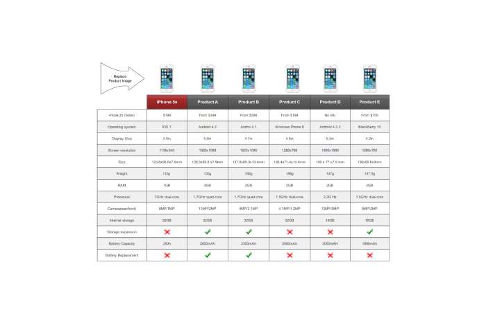
4: Create Your Comparison Table
Comparison tables are the centerpiece—design them for scannability.
Table structure best practices:
| Feature | Product A | Product B | Winner |
| Price | $29/month | $19/month | Product B |
| Storage | 500GB | 1TB | Product B |
| Integrations | 2,000+ | 100 | Product A |
| Mobile App | iOS + Android | iOS only | Product A |
| Support | 24/7 chat | Email only | Product A |
Design elements:
- Use checkmarks (✓) and X marks () for yes/no features
- Highlight winning product with subtle background color
- Include “Winner” column for quick scanning
- Group similar features together
- Bold key differentiators
Mobile responsiveness:
70% of comparison searches happen on mobile. Tables must:
- Collapse gracefully on small screens
- Allow horizontal scrolling if needed
- Prioritize most important features at top
- Consider vertical “card” layout for mobile
5: Deep-Dive Feature Comparisons
After your summary table, expand on key features with context.
Organizing by feature category:
H3: Performance
Explain what performance means for this product category, then compare.
Example (laptops): “For video editing, processing power determines how smoothly you can scrub through 4K timelines. The MacBook Pro M3 Max handles 8K footage without dropped frames thanks to its 16-core GPU. The Dell XPS 15 with RTX 4060 performs admirably with 4K but stutters slightly with 8K. For most users editing 1080p or 4K, both are excellent. Only professional colorists working with 8K RAW files will notice the MacBook’s advantage.”
Adding context and examples:
Raw specs mean nothing without context. Compare:
“Laptop A has 32GB RAM”
“Laptop A’s 32GB RAM allows you to run Photoshop, Premiere Pro, and 50 Chrome tabs simultaneously without slowdown”
6: Include Pricing Breakdown
Pricing confusion loses sales. Be crystal clear.
Pricing table design:
| Plan | Product A | Product B |
| Free tier | 5 users, 10GB | Not available |
| Starter | $12/user/month (annual) | $15/user/month |
| Professional | $25/user/month | $20/user/month |
| Enterprise | Custom | $40/user/month |
| Hidden costs | $5/month API access | Storage add-ons ($10/100GB) |
Addressing hidden costs:
Don’t just list base prices. Call out:
- Mandatory add-ons
- Per-user vs. flat pricing
- Annual discount percentages
- Setup or onboarding fees
- Premium support costs
- Feature paywalls
Example:
“While Product B appears cheaper at 45/month plan to access SSO and priority support—features included in Product A’s $25 plan. For teams over 10 users, Product A actually costs less.”
7: Add Social Proof and User Feedback
User reviews provide the third-party validation readers crave.
Where to find authentic reviews:
- G2 Crowd, Capterra, TrustPilot (B2B software)
- Amazon reviews (devices and consumer products)
- Reddit discussions (honest, unfiltered opinions)
- App Store / Play Store reviews (mobile apps)
- YouTube comment sections (real user experiences)
Integrating testimonials:
Include 2-4 user quotes highlighting different perspectives:
Example:
“‘Switched from Competitor X to Product A and onboarding was seamless. Their migration tool moved all our data in 20 minutes.’ — Sarah M., Marketing Director”
“‘Product B’s interface feels cluttered compared to Product A. We’re sticking with Product A despite the higher price.’ — James T., Small Business Owner”
Include both positive and constructively negative feedback for credibility.
8: Write a Clear Conclusion with Recommendations
End with specific, actionable recommendations based on user scenarios.
Matching products to user types:
“Choose Product A if you:
- Need advanced automation features
- Have a team larger than 20 people
- Require extensive third-party integrations
- Budget allows for $25+/user/month
Choose Product B if you:
- Prioritize simplicity over features
- Team is under 10 people
- Want the lowest price point
- Don’t need SSO or advanced security”
Strategic CTA placement:
Position CTAs at three points:
- Top of post (soft CTA): “Jump to comparison table”
- After comparison table (medium CTA): “Try Product A free” or “See full specs”
- Conclusion (strong CTA): “Start your 14-day trial” or “Get Product A today”
Use different CTA intensities to match reader readiness.
Product-Specific Comparison Strategies
Different product categories require tailored approaches.
Comparing Physical Devices (Laptops, Phones, Cameras)
Emphasis areas:
- Build quality and materials (can’t be tested without hands-on)
- Battery life (quantifiable: hours of use)
- Display quality (brightness, color accuracy, resolution)
- Durability and warranty
Research methods:
- Read professional reviews (MKBHD, The Verge, TechRadar)
- Visit stores for hands-on testing when possible
- Check manufacturer spec sheets for exact specifications
- Look for torture tests and drop tests on YouTube
Visual requirements:
- High-quality product photos
- Size comparisons (side-by-side images)
- Interface screenshots
- Video demonstrations
Comparing Software and Apps
Emphasis areas:
- User interface and ease of use
- Feature depth vs. simplicity trade-off
- Learning curve and onboarding
- Integration ecosystem
- Mobile app parity with desktop
Research methods:
- Sign up for free trials yourself
- Test core workflows
- Export sample data to test export features
- Contact support to evaluate response time
- Join user communities (Reddit, Facebook groups)
Visual requirements:
- Interface screenshots (dashboard, key features)
- Workflow demonstrations
- Mobile app screenshots
- Integration connection examples
Comparing SaaS Tools
Emphasis areas:
- Pricing transparency and hidden costs
- Scalability (what happens at 10 vs. 100 vs. 1,000 users)
- Implementation complexity
- Customer support quality
- Contract flexibility (monthly vs. annual)
Research methods:
- Request demos from sales teams
- Read G2/Capterra reviews focusing on migration and support
- Check downtime history (DownDetector, status pages)
- Review API documentation quality
- Test cancellation process
Comparing Consumer vs. Enterprise Products
Consumer products:
- Focus on ease of use and immediate value
- Price sensitivity is higher
- Reviews from individual users matter most
- 30-day return policies and warranties important
Enterprise products:
- Emphasize scalability, security, compliance
- ROI and TCO (total cost of ownership) calculations
- IT administrator perspective alongside end-user
- Implementation services and training availability
Creating Effective Comparison Tables
Tables make or break comparison content.
Essential Table Elements
Must-have columns:
- Feature/Criteria name
- Product A details
- Product B (and C, D) details
- Optional: “Winner” or “Rating” column
Must-have rows:
- Price (always at top)
- Core features (3-5 most important)
- Differentiators (what’s unique)
- Support options
- Trial/refund policy
Feature selection:
Include 10-15 features maximum. More creates cognitive overload.
Prioritize features that:
- Differ meaningfully between products (skip identical features)
- Matter to your target audience (not just impressive specs)
- Influence purchase decisions (deal-breakers or dealmakers)
Visual Design Best Practices
Color coding:
- Green checkmarks for “Yes” or advantages
- Red X or “-” for “No” or disadvantages
- Yellow warning for “Limited” or caveats
- Subtle highlight for winning product (light background color)
Typography:
- Bold feature names for scannability
- Regular weight for details
- Use icons where possible (✓, , ★ for ratings)
Spacing:
- Generous padding in cells
- Alternating row colors for readability
- Border lines to separate sections
Mobile-Friendly Table Design
Responsive strategies:
- Card layout: Stack products vertically on mobile
- Horizontal scroll: Allow swipe for full table
- Collapsible sections: Expand/collapse feature categories
- Simplified mobile view: Show only top 5 features, link to full comparison
Test on actual mobile devices—what looks fine on desktop often fails on 375px screens.
Maintaining Credibility While Being Persuasive
The paradox of comparison content: be helpful yet drive conversions.
The Unbiased vs. Persuasive Balance
How to achieve both:
- Present objective data first: Specs, features, pricing
- Add subjective analysis after: “For most users, Feature X won’t matter because…”
- Acknowledge trade-offs honestly: “Product A costs more but includes features that justify the price”
- Match products to personas: Show which product fits which user type
Example of balanced comparison:
“Product A offers 200+ integrations versus Product B’s 50. However, most users only need 5-10 integrations. Unless you’re building complex workflows requiring niche tools, Product B’s integration library will likely cover your needs at half the cost.”
Disclosing Your Affiliation
FTC requires disclosure when:
- You receive affiliate commissions
- You’re comparing your own product
- You have business relationships with vendors
Effective disclosure language:
“Full disclosure: I’m the founder of Product A. This comparison is based on public information, user reviews, and testing. I’ve made every effort to present competitors fairly. If anything seems inaccurate, contact me.”
Or:
“This post contains affiliate links. If you purchase through them, we earn a small commission at no cost to you. This helps us continue creating free content. All recommendations are based on genuine testing and research.”
Place disclosure early (first 200 words).
Handling Negative Product Features
Don’t hide limitations—address them constructively.
Instead of ignoring weaknesses:
“Product A lacks built-in video calling, which Product B includes. However, Product A integrates seamlessly with Zoom and Teams, which most teams already use. For teams without existing video tools, Product B provides immediate value. For teams with video tools, Product A’s integration approach reduces tool sprawl.”
This acknowledges the limitation while providing context that helps readers decide if it matters for their situation.
SEO Optimization for Comparison Posts
Comparison content has specific SEO requirements.
Keyword Strategy for Comparison Content
Primary keyword placement:
- H1 title
- URL slug
- First 100 words
- At least 2-3 H2 headings
- Image alt text
- Meta description
Comparison-specific keywords:
- “vs” or “versus”
- “compared”
- “alternatives to”
- “best [category]”
- “which is better”
Long-tail variations:
- “Product A vs Product B for [use case]”
- “Product A vs Product B [year]”
- “Product A or Product B reddit”
Schema Markup Implementation
Add structured data for rich results:
Product Schema:
json
{ “@type”: “Product”, “name”: “Product A”, “offers”: { “price”: “29.00”, “priceCurrency”: “USD” }, “aggregateRating”: { “ratingValue”: “4.5”, “reviewCount”: “287” }}
Review/Comparison Schema: Use Review schema if you’re providing ratings.
Benefits:
- Star ratings in search results
- Price display in snippets
- Increased click-through rates (10-30% improvement)
Internal Linking Strategies
Link comparison posts to:
- Individual product review pages
- Category overview pages
- Related comparison posts
- Buying guides
- Product landing pages
Anchor text examples:
- “Read our full Product A review”
- “See more [category] comparisons”
- “Compare Product A with other options”
Conversion Optimization Elements
Design for decision-making, not just information delivery.
CTA Placement Strategy
Three-tier approach:
1 – Early (after intro): Soft CTA
“Jump to comparison table or See pricing breakdown”
2 – Mid-content (after table): Medium CTA
“Try Product A free for 14 days — no credit card required”
3 – Conclusion: Strong CTA
“Get started with Product A today and join 10,000+ teams streamlining their workflow”
CTA best practices:
- Use action verbs (Get, Start, Try, Compare)
- Include value proposition (free trial, instant access)
- Create urgency when appropriate (limited-time discount)
- Use contrasting button colors
Trust Signals and Badges
![]()
Build confidence with:
- Star ratings (⭐⭐⭐⭐⭐ 4.8/5 from 500+ reviews)
- Award badges (“PCMag Editor’s Choice 2026”)
- Certification logos (if applicable)
- “Updated: March 2026” timestamps
- Author credentials (“Tested by certified professional”)
Addressing Buyer Objections
Common objections to address:
“Is it worth the price?”
Show ROI or time savings: “Product A costs 600 in saved time at $20/hour rates”
“Will it work for my team size?”
“Product A scales from 5 to 5,000 users. We tested with teams of 10, 50, and 200—performance remained consistent”
“How hard is migration?”
“Product A provides free migration assistance. Our team switched from Product B in under 3 hours with zero data loss”
Maintaining and Updating Comparison Content
Comparison posts require ongoing maintenance to stay relevant and authoritative.
Quarterly Review Process
Every 3 months, check:
- Pricing updates (plans change frequently)
- New features launched
- Product discontinuations or acquisitions
- User review sentiment shifts
- Competitor landscape changes (new entrants)
- Broken links and images
Set calendar reminders for each comparison post.
Monitoring Product Changes
Subscribe to:
- Product changelog/release notes
- Company blogs and newsletters
- Industry news sites (TechCrunch, The Verge)
- Competitor social media
- Google Alerts for product names
Major updates requiring immediate revision:
- Pricing changes >20%
- Significant feature additions/removals
- Company acquisition or shutdown
- Major UI redesigns
- Security breaches or scandals
Refresh vs. Rewrite Decision
Refresh (minor updates) when:
- Pricing changed
- 1-2 new features added
- User ratings shifted slightly
- Screenshots need updating
Time required: 1-2 hours
Rewrite (major overhaul) when:
- Product fundamentally changed (major version upgrade)
- Comparison no longer relevant (discontinued product)
- New competitors emerged as leaders
- Your original criteria no longer match user needs
Time required: 5-10 hours
The Bottom Line
Writing effective product comparison posts requires balancing thorough research, transparent presentation, SEO optimization, and conversion design. The most successful comparison content.